IBM originally asked Helios to create a digital interactive data visualization experience for IBM Insight 2015, an event held in October of 2015 at the Mandalay Bay Convention Center in Las Vegas, NV. Titled IBM Data Visualizer, the original experience was designed to display an impressive, stylized visualization of a collection of IBM’s marketing content — including text, infographics and video — on a single 98” touch screen, with additional elements from the main screen being projected onto a large overhead screen.
The experience proved to be popular enough with event attendees that IBM turned to Helios for an update and follow up to be deployed at IBM Interconnect 2016, an event held once again at Mandalay Bay Convention Center in February of 2016.
The Experience
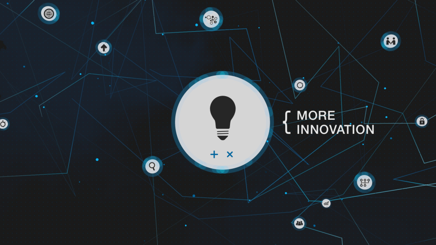
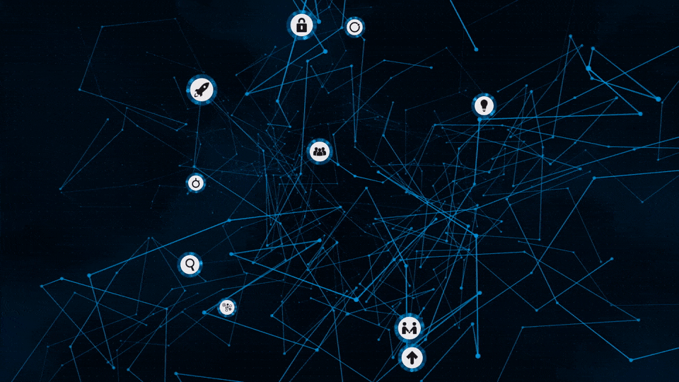
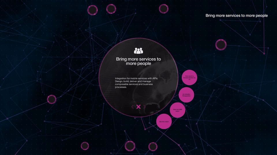
At its core, the newly updated experience was the same as the last go-around. A network of interconnected nodes, each with unique icons that float around on a space-like canvas. Each node contains different marketing messages delivered in the form of various media that users are able explore by touch input. For the reboot, IBM wanted to add an easter egg to the experience. After some ideation with Helios, IBM settled on a classic video game mechanic, a memory game similar to Simon.
Hidden away inside of a special new “game node” intended for the user to discover while exploring, Machine: The Pattern Game offered a quick distraction and a fun attraction for the user amidst the more serious, business-oriented content available in the app. Attendees of the event tried their hand at defeating the Guinness world record of Most sequences completed in a game of Simon, which is presently 14. One user even managed to achieve a score of 16, unofficially defeating the official world record.
As with the previous deployment, while attendees interacted with the experience, metrics were being collected behind the scenes on what content was being viewed the most. Helios collected various data for IBM, including data on node actions and total sessions.
Visual Updates
IBM also wanted Helios to experiment with the visuals as part of the update. A new set of animations was added to transition between the key interaction states as users explore the experience. A complementary new color palette was also designed to evoke the IBM brand and to fit in with the rest of the themes from the Interconnect event. In addition, prominent new labels were also added to the UI which appear describing each icon as they are interacted with by the user.
 Animation Transition GIF
Other Updates
Also new for this iteration was a button that attendees could use to summon the help of an IBM Brand Ambassador if they had questions. Whenever the “Talk to an Expert” button was pressed, an SMS message was dispatched to brand ambassador iPhones which contained instructions for how to locate the user and informed the brand ambassadors of what content the user was viewing at the time they asked for help. Helios utilized Twilio’s REST API to send the SMS messages.
The newly updated IBM Interconnect Visualizer was deployed in four different locations on the floor of the show, so each station was configured to generate a message with a unique identifier per location. This was accomplished through the use of a templated message with replacement variables. For example, the string {location}, when placed inside of a block of text, was parsed and replaced with the actual location as configured in the application configuration file. There were several such replacement variables used to generate the final messages.
Challenges
Though it is not new to the updated version of the experience for Interconnect, an interesting technical challenge surfaced when the Helios team began implementing the node-based particle system in the original IBM Data Visualizer. Working from static mockups and a description of the dynamic behavior and feel desired, the team tried various iterations to achieve the “organic” motion that was described. The network of interconnected nodes had two basic types: passive and interactive. Passive nodes were the dots interconnecting the lines and interactive nodes were the larger nodes which contained IBM’s content. Each had to move in a 3D space. All nodes also needed to have appropriate collision reactions and a natural, zero-gravity feel to them. In the end, the team managed to incorporate the idea and achieve the desired result by mixing 2D and 3D physics mechanics. The final result can be seen here in this animated GIF:
 Node System Animation
Project Summary
IBM Interconnect Visualizer was deployed for a total of four days from Monday, February 22nd to Thursday, February 25th 2016. Overall, the new activation was a resounding success for Helios and it is our hope that the IBM Visualizer will continue to be a staple at future IBM events.
Producer – Lynsey Oetinger
UI / UX – Tyler Wilson
Developers – Corey Struzan, Devin Thompson, Sepehr Laal
QA – JJ Zingale